 Previous Topic
Visual Analysis Window Elements
The Visual Analysis window contains the following elements:
Toolbar
 Menu
Menu
- New
Starts a new visual analysis in a new Visual Analysis window. - Open
Opens an existing analysis template in a new Visual Analysis window via the Open dialog. - Save
Saves the changes to the current analysis template. - Save As
Saves the current analysis template with a different name or location or as a new version in the Save As dialog. - Undo
Undoes the last operation. - Redo
Reverses the operation of Undo. - Clear Filters
Clears the filters in the Filters panel. - Swap
Exchanges the row headers and the column headers. - View
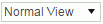
Specifies the view mode:- Normal View
The Logi JReport smart layout. Scrollbar will be provided horizontally or vertically if the available space cannot hold all the data. - Fit Height
All vertical data are displayed according to the available height. - Fit Width
All horizontal data are displayed according to the available width. - Fit Visible
The combination of Fit Width and Fit Height. All data are displayed horizontally and vertically according to the available space.
In the Fit XXX mode, the column header height, row header width, and the header font size is the same as that in Normal View. The text in the header will be cut if it cannot be fully displayed.
- Normal View
- Help
Displays the Visual Analysis user's guide. - Exit
Exits the Visual Analysis window.
 Undo
Undo
Undoes the last operation.
 Redo
Redo
Reverses the operation of Undo.
 Refresh
Refreshes the current data result.
 Open
Open
Opens an existing analysis template in a new Visual Analysis window via the Open dialog.
 Save
Save
Saves the changes made during the visual analysis.
 Save As
Saves the current analysis template with a different name or location or as a new version in the Save As dialog.
 Swap
Swap
Exchanges the columns and rows in the data presentation area.
 View mode
Specifies the view mode from the drop-down list.
 Back to top
Left Panels
Resources panel
This panel lists all the fields in the selected business view. It provides data resources to the Filters panel and to the presentation area.
Filters panel
This panel lists the filters being used. You can add new filters by dragging group fields from the Resources panel into the Filters panel. The newly added filters provide full values by default.
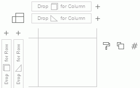
Presentation Area
This is where you perform visual analysis actions. Follow the instructions in this area to drag data fields from the Resources panel to the desired positions in the presentation area. As you start to drag a field, the possible places where you can drop it are highlighted with a red border. As you add groups to the rows or columns the crosstab expands to include the new group and all of the aggregations are recalculated.
Only group and aggregation fields can be added into the data presentation area.
The following are details about each element:
Column and Row control boxes
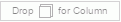
Group fields can be added to this control box to become column headers.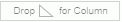
Aggregation fields can be added to this control box to become column headers. The fields are used to draw axes horizontally at the bottom.
Group fields can be added to this control box to become row headers.
Aggregation fields can be added to this control box to become row headers. The fields are used to draw axes vertically on the left.
Specifies the display type of the data values displayed in the data presentation area. The following display types are supported:
 Text
Text
The data values are displayed in text. This type requires that a data field is defined by the label legend in the legend section.
 Bar
Bar
The data values are displayed in bar chart. Line
Line
The data values are displayed in line chart. Pie
Pie
The data values are displayed in pie chart. Shape
Shape
The data values are displayed as shape diagrams.
Legend section
The following introduces all available legend types. Some legend types are specific to certain display types.
 Color
Color
The color legend allows you to identify the members of a data field by colors.Data fields that can be bound with the color legend should be either of the following:
- One or more group fields.
- One single aggregation field.
Multiple aggregation fields and the combination of group and aggregation fields are not supported.
For a single field, each field member is marked by a distinct color. For multiple group fields, each combination of the members of the fields is marked by a distinct color.
- Label
The label legend can be bound with multiple data fields to provide label text to the members of the data fields.  Size
Size
The size legend can be bound with at most one data field to identify the members of the data field by sizes. Slice
Slice
The slice legend can be bound with at most one aggregation field to identify the members of the aggregation field by sections divided from the center point in pies. It is available to the Pie display type only. Shape
Shape
The shape legendcan be bound with at most one data field to identify the members of the data field by shapes.It is available to the Shape display type only.