Create a Data Table
This document introduces the Logi Data Table, which is one of the fundamental structures for displaying report data. It consists of a grid of rows and columns, which displays data (usually) in a row and column arrangement. These "tabular" displays in a report look good and are easy to work with. This document includes the following topics:
- Introduction to Data Tables
- Use the Data Table Wizard
- Create a Data Table Manually
- Data Table Links
Introduction to Data Tables
Data tables in Logi reporting products are dynamic, data-driven reporting components. Unlike basic HTML tables built using the Rows, Row, and Column Cell elements, data tables are designed column-by-column rather than row-by-row.
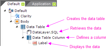
As shown above, every data table must have the following components:
- A Data Table element
- One or more DataLayer elements to retrieve and cache the data, possibly with child Filter elements
- One or more Data Table Column elements to display each column
- One or more report content elements, such as a Label, to present the data
This column-wise approach can be confusing. Just remember that, at runtime, everyrecord in the datalayer will be iterated and rows for all of the data will be displayed in the table. Developers create and configure each column, while the number of rows is entirely dependent on the data.
The Data Table Column element, for example, is configured to provide the column header text, column width (if not automatically determined), and so forth.
The actual data values in the datalayer are accessed using tokens, such as @Data.CategoryID~, where the second part of the token is the column name in the datalayer. This case-sensitive token can be used in Label element Captions, for example, to display the data. See our document Token Reference for more information about tokens.
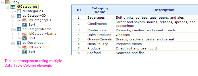
Note: the table shown above has had style applied to it to specify its fonts, borders, and background colors. An easy way to quickly style a data table is to apply a Theme to your report definition.
The most common way to design data tables is to have a Data Table Column element for each column in the datalayer, as shown above. This works well when you have many records that you want to show in a table.
The order of the columns in the displayed data table is governed by the order of the Data Table Column elements in the definition. The top-most of these elements in the definition will be the left-most column in the displayed data table. Developers are free to rearrange the order of columns by selecting a Data Table Column element in Logi Studio and dragging it, or by using the Up/Down Arrow buttons in the toolbar. This is particularly useful if a wizard has been used to create the data table and a different column arrangement is desired.
The one-to-one correspondence of data columns to Data Table Columns elements discussed above is not required and developers have complete freedom over the way data is presented in a report. Suppose, for example, that you don't want the typical tabular format.
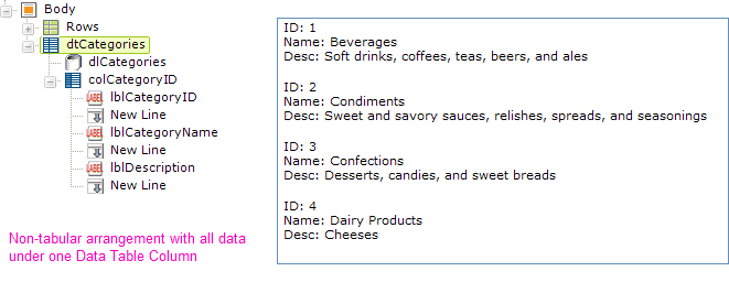
Suppose instead you want to stack the data in a kind of form when you display it. This is easy to do, as shown above. The data is presented in a form-like manner by using just one Data Table Column element and placing multiple Label elements within it. Each Label element displays the data from a different data column in the datalayer. There's no limit on the number of elements you can place beneath a single Data Table Column element and you can, in fact, even place HTML tables and charts there!
Important Scope Limitation
The scope of the data in a datalayer is limited to the Data Table element that contains it and its child elements. So, looking at the example above, the token @Data.CategoryID~ is valid in all elements beneath the data table dtCategories, but will be empty if you attempt to use it elsewhere, such as in the Report Header element.
Tip: The only exception to this scope limitation is the Local Data element. This element works with a datalayer which retrieves just one result row but its data is available, using the @Local.<columnName>~ token, anywhere in the report definition.
Use the Data Table Wizard
The easiest way to create a data table is to use one of the wizards provided in Logi Studio. Aside from preventing spelling errors and minimizing tedium, one of the benefits of using the wizard is that a default style sheet and images for graphical paging controls are automatically copied into your application from the Logi Studio installation folder.
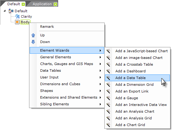
To create a data table based on a SQL query:
- As shown above, in Studio, select and right-click your definition's Body element, select Element Wizards, and then select Create a Data Table for a SQL Query wizard from the secondary menu.
- Click Next to start the wizard.
- Type a unique ID for the Data Table element and click Next.
- Type a unique ID for the DataLayer.SQL element and click Next.
- Choose a database connection from the Connection ID drop-down menu and click Next.
- Create a SQL query to retrieve the data and click Next.
- Select the table columns to display and click Next.
- Determine if the table should have paging controls and click Next.
- If paging controls were added, choose the number of rows to display per page and click Next.
- If paging controls were added, determine if the paging controls are graphical or textual and click Next.
- Click Finish.
The wizard will add to your definition all of the elements required to create the table you described. The wizard automatically gives each column interactive sorting capabilities.
If you already have your data table and datalayer elements added and configured, another wizard - "Add data columns" - is available when you select the Data Table element.
Create a Data Table Manually
The wizards described above work well for data retrieved by a SQL query, however developers may need to manually create their tables when data is retrieved from a different type of datasource.
To do this, simply add the necessary elements to your definition in Studio. After you add your first Data Table Column and its child elements (Label, Sort, etc.), you can speed things up by copying and pasting it into the element tree as many times as necessary, then going back and configuring the individual elements. Copying the Data Table Column element will also copy all of its child elements, too.
In these circumstances, the issue of spelling becomes more important. @Data tokens are case-sensitive and column names must be spelled accurately. To ensure that you know exactly how column names are spelled, you may care to turn on debugging and view the actual data in the datalayer. See Debugging Reports for more information about debugging.
Data Table Attributes
The Data Table element includes the following attributes. Note that Themes automatically set a number of these attributes "behind-the-scenes".
| Attribute | Description |
|---|---|
| Ajax Paging and Sorting | Enables AJAX-style paging and sorting. When the user moves to another page of table data, or sorts a column, only the table portion of the page is updated. This method prevents the web page from flickering or losing its scroll position. This alters the behavior of the browser's "Back" button because the page history is updated with AJAX Paging. Default value: False |
| Alternate Row Class | Specifies a style class to be used for every other row of the table, making it easier to read across the columns in single row. Themes include a class called ThemeAlternatingRow which you can assign, if desired. |
| Border | Specifies, in pixels, the width of a border, if any, to be displayed around the table. A value of 1 displays a thin border. |
| Caption | Specifies the text of a caption, or "title", that will appear above the table. Leave this blank to suppress it. |
| Caption Class | Specifies a style class to be applied to the caption text entered in the previous attribute. |
| Cell Spacing | Specifies the width, in pixels, of the space between table cells, if any. Default: 0. |
| Class | Specifies a style class to be applied to the table as a whole. |
| Column Header Class | Specifies a style class to be applied to the column headers. |
| Draggable Columns | Specifies if the user can reposition columns by dragging the column header side-to-side. When enabled, any changed column positions are remembered for the table for the current session. Draggable Columns may not be used when there are custom header rows in use with columns that span multiple columns. Default: False |
| Hide When Zero Rows | Specifies it the Data Table is to be hidden when the datalayer returns zero rows. Default: False |
| Keep Scroll Position | When enabled, causes the browser's horizontal and vertical scroll positions to be retained when the current report is redisplayed without first going to another report. Use this to refresh the current report while avoiding resetting the scroll position to the top. Default: False |
| Layout | Specifies if the table layout should be automatically determined by all the data (Auto) or just the first row of data (Fixed). If Fixed is specified, the column layout is determined based on the width of the values in the first data row, instead of adjusting the column widths by examining data in every row. This can help with formatting issues, and can also significantly improve large table performance. Default: Auto |
| Remember Sort | Specifies whether or not to retain the user's sort selection. When True, and the user sorts the data table on a particular column, the report will be redisplayed with the same sort order the next time the report is displayed. Sort selections are retained only for the user's current session. Default: False |
| Resizable Columns | When enabled, a small icon appears on the right edge of the column header when the mouse hovers over it and the user can resize columns at runtime by dragging the icon right or left to a different width. The updated column width are remembered for the table for the duration of the current session. You may not use Resizable Columns when there are custom header rows in use with columns that span multiple columns. Default: False (v11.0.519+) |
| Row Class | Specifies a style class to be applied to the table rows. This value can be an @Data token, so the class can be applied dynamically based on the data. |
| Security Right ID | When specified, access to this element can be controlled with Logi Security. Specify the ID of a Right defined in the application's _Settings Security element. Only users with matching rights will be able to see the element. |
| Sort Arrows | Specifies whether Sort direction indicators (arrows) will be displayed when the user clicks a column header to sort the table. Default: False |
| Width | Specifies the total width of the data table. |
| Width Scale | Specifies the scale to be used when applying the value of the previous attribute, px for pixels, or % for percentage of the table's parent container's width. |
In general, the fewer attributes you have to set for a Data Table, the better. Let a Theme or the browser figure out the best combination of attributes for you.
About Table and Column Widths
Browser engines are designed to do the best job they can with HTML tables (which is the structure underlying a Data Table) when it comes to automatically figuring out column widths. Here are two tips to make widths work for you. First, always set a width for Data Tables. And, second, if you're concerned about ensuring that one or two columns have a specific width, then set those widths in the appropriate Data Table Column elements and leave the widths for the other Data Table Column elements blank. You don't need to try to figure out what the width of every column will be, ensuring it all adds up to 100% of the table width. The browser will try to guarantee the widths you've specifically set and will divide and allocate the remaining space among the remaining columns, when it can.
And remember that it is possible to put so many conflicting restrictions (via attribute values) in place that the browser will get confused and produce weird results. If that happens, try removing width attribute values for columns until things look normal again, then reconsider the issue.
Data Table Links
A common requirement is to be able to click the actual data in a data table cell and do something with the clicked value.
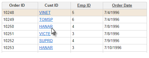
The image above shows an example of this, and here are the elements needed to make that work:
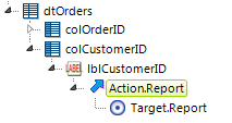
As shown above, an Action element is placed beneath the Label element used to display the data in each column. An appropriate Target element is also included

Finally, a Link Parameters element is added, as shown above, to pass a data value to the target.