Force Chart's X-Axis to show all Labels
I have a Chart ("#Chart1") defined with an Axis Type of "Category". The Chart's X-Axis Labels are showing every other value (sometimes every 3rd or 4th, depending on the number of values and the size of the Chart). I need to force the Chart to show all X-Axis Labels regardless of the Chart size. How do I do this in Info 14.0 SP1?
I've seen that HighCharts has a 'step' option (https://stackoverflow.com/a/39997109/14829963), but I can't seem to find the corresponding setting in Info. How can I incorporate this change in my Info definition?
Sample Report:
<Report ID="TestShowAllXAxis">
  <Body>
    <ChartCanvas ID="Chart1" ChartHeight="300" ChartWidth="400">
      <DataLayer Type="Static" ID="dls" IdeDisplayStatus="Collapsed">
        <StaticDataRow id="1" type="apples" quantity="5" />
        <StaticDataRow id="2" type="oranges" quantity="10" />
        <StaticDataRow id="3" type="pears" quantity="3" />
        <StaticDataRow id="4" type="peaches" quantity="22" />
        <StaticDataRow id="5" type="grapes" quantity="140" />
        <StaticDataRow id="6" type="bananas" quantity="6" />
        <StaticDataRow id="7" type="mangoes" quantity="1" />
        <StaticDataRow id="8" type="watermelons" quantity="2" />
      </DataLayer>
      <Series Type="Bar" ChartYDataColumn="quantity" ChartXDataColumn="type" ChartXDataColumnType="Text" ID="bar1" LinkedToXAxisID="xAxis" />
      <ChartXAxis ID="xAxis" AxisType="Category">
        <AxisLabelStyle FontAngle="35" FontSize="12" />
      </ChartXAxis>
    </ChartCanvas>
  </Body>
</Report>
-

The only think I can think of immediately is to remove the graph "ChartWidth" setting and either leave it blank or set it to "50%".
Update: I just installed Logi Info 14.1 SP2 and it displays fine "as is". This might be part of the documented enhancements:
As a report developer, you can now customize your Chart Canvas to add gradients using CSS in styled mode, specify how many ticks are rendered on your chart axes, and enable tick auto rotation to prevent overlapping labels on your horizontal axis.0 -

Hi Johnny,
I have noticed this in the past and have not found out how to force and would like to know.
However, I just did a quick fix, change the orientation of the font by setting font angle usually 45 but have used 90, 270, etc. I have some long label names, some 25 chars and 30 fields so I also resize the font. I have also used horizontal bar charts or pie charts for many of these charts. I have not used charts as small as you have defined, mine are 450x600.
Sorry I can not be more helpful.
Cheers
Steve0 -

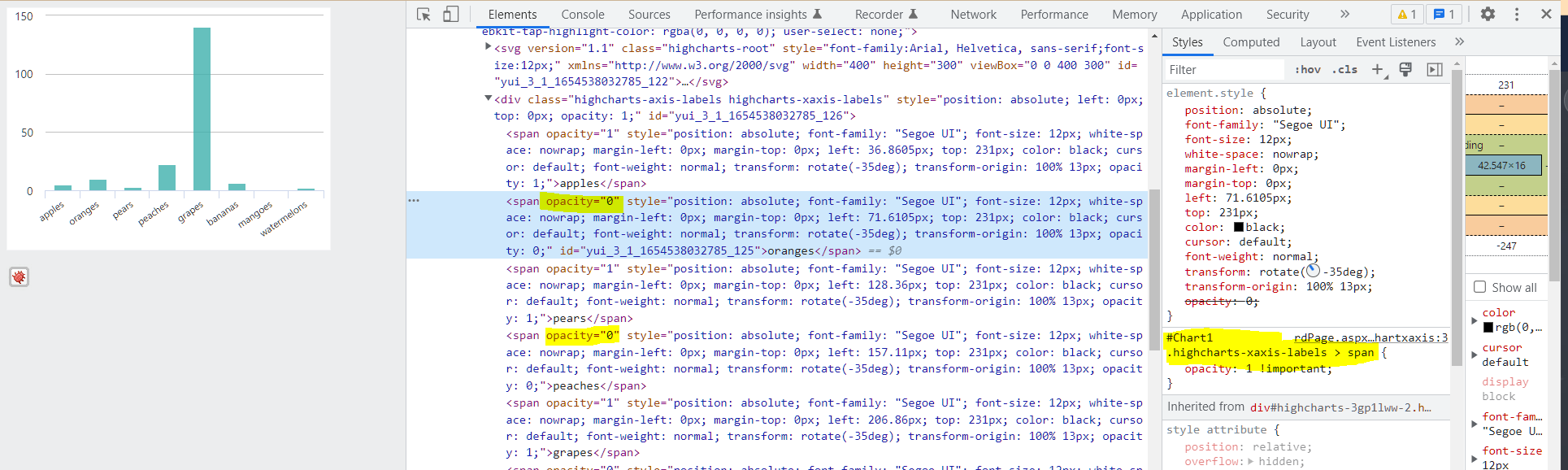
Actually, if you look in the browser console, the labels are being rendered, except the span has an opacity of 0.
#Chart1 .highcharts-xaxis-labels > span {
    opacity: 1 !important;
}
1 -
 1
1 -
This causes an additional problem in my display if I resize the chart. Making it larger, dragging from the right, will display all labels. Resizing to the original then retains all labels, however, they now over lap each other. The chart does not refresh when shrinking it.
I am the only one seeing this?
0 -

Hey VISUI
Thanks again! The CSS is the ticket for getting all of the labels to appear.
You guys are also correct that the visibility can be triggered based on the chart size and font size/angles. For some reason 14.1.x doesn't behave this way but 14.0 SPs 1, 2, and 3 do this auto-hide thing. I can't update all of my environments just to resolve this, so I'm going with the CSS edit that John Sweazen posted from VISUI
Thanks all!!
1 -
Johnny's original chart does not allow for resize. This solution will work with a chart sized to 100% of its container and will display correctly based on the resizing of that container.
IMO the Logi Chart Resizer provides a terrible user experience and should only be used in situations that require it.
Charts should be sized to fill their container width, and the resize capability should be placed upon that container.
The behavior Johnny is seeing with this chart should NEVER occur with a categorical X-Axis, because unlike a numerical or date sequence there is no way to infer what the missing label implies. This might be a Logi or Highcharts bug.0 -
Hey VISUI
The CSS is working to render all xAxis labels on the web output. However, the PDF and Excel exports are not including this change because they are using HighCharts getSVG() API which grabs the under-the-hood HighCharts code. So I need to find a way to force the X-Axis Labels to appear in HighCharts and not just via CSS. I've got this working-ish using the method I put in another post for the exports - https://devnet.logianalytics.com/hc/en-us/community/posts/6493612137111-New-option-for-live-export-of-Chart-to-PDF-Excel by adding the following line just after chart.getSVG() to force the replacement of all opacity=0 to opacity=1. I can't think of a use case or scenario in this report where I would want (or where the output would trigger) an opacity of '0', so this works for now, but it feels brute-forcish.
svg = svg.replaceAll('opacity="0">','opacity="1">');
Any other ideas for this?
Thanks,
Johnny0
Please sign in to leave a comment.
Comments
8 comments