Alternate Data Label

I'm working on a chart using Series.Bar Range. It is essentially a Gannt chart. Visually, it is good and shows a simple bar from 2011 to 2016. I want to display the total amount of spend on that chart, but data labels show 2011 to 2016. Is there a way to specify the value not defined in the low/high value (i.e. Data Labels Column = MyNumericColumn)? Am I stuck using the API?
-

HI Blake,
I display Data Labels in some of my reports, the value comes from Y-axis Data Column in mine. The X-axis has name which is not displayed. I can display the data labels in both orientations of the bar chart, Default and Swap Axes
Are the labels you are using coming from this?
If not share a little more information on which values are used for X and Y Axis.
Cheers,
Steve
0 -
Steve, thanks for the reply. I know your name from somewhere but can't place it. Maybe we met at the conference in the past.
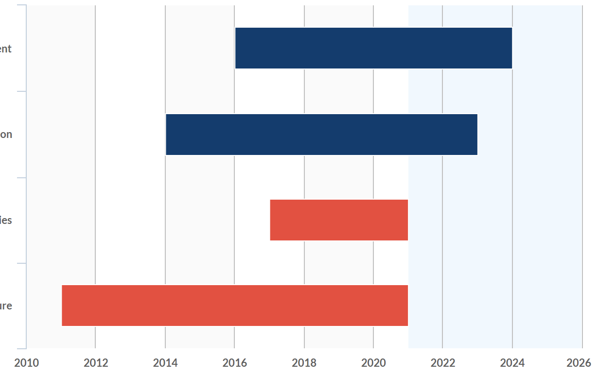
Anyhow, here is a screenshot. The values that show up when data labels are turned on are the start year and end year. What I really want is how many $$$ are allocated over the time period. I can get that in my quicktip on hover, but I'd love to show it on the graph. End-users.....
 0
0 -
Hi Blake,
I been to both conferences, I am sure we must have met up.
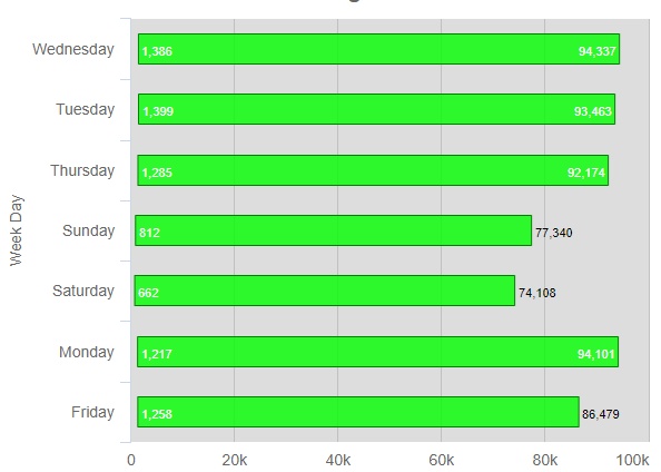
I have just created Series,Bar Range from scratch. I am not using years like you but days of the week, range LastWeekStart to LastWeekEnd. Group filter on DayofWeekName and create High and Low GroupAggregatedColumns. X-axis Data Column, DayofWeekName. No attributes in Data Labels. I can share some code if it helps.
These charts are Default/SwapAxes.

Steve
0 -
I think the difference between our setups is that the charts above the Y-axis axis go along with the actual representation of the bars. In my use case, I essentially have X (category), Y (year), and "Z" (amount). I don't want to represent the "Z" in the length of the bar, but rather I'd like to just see the amount as a label.
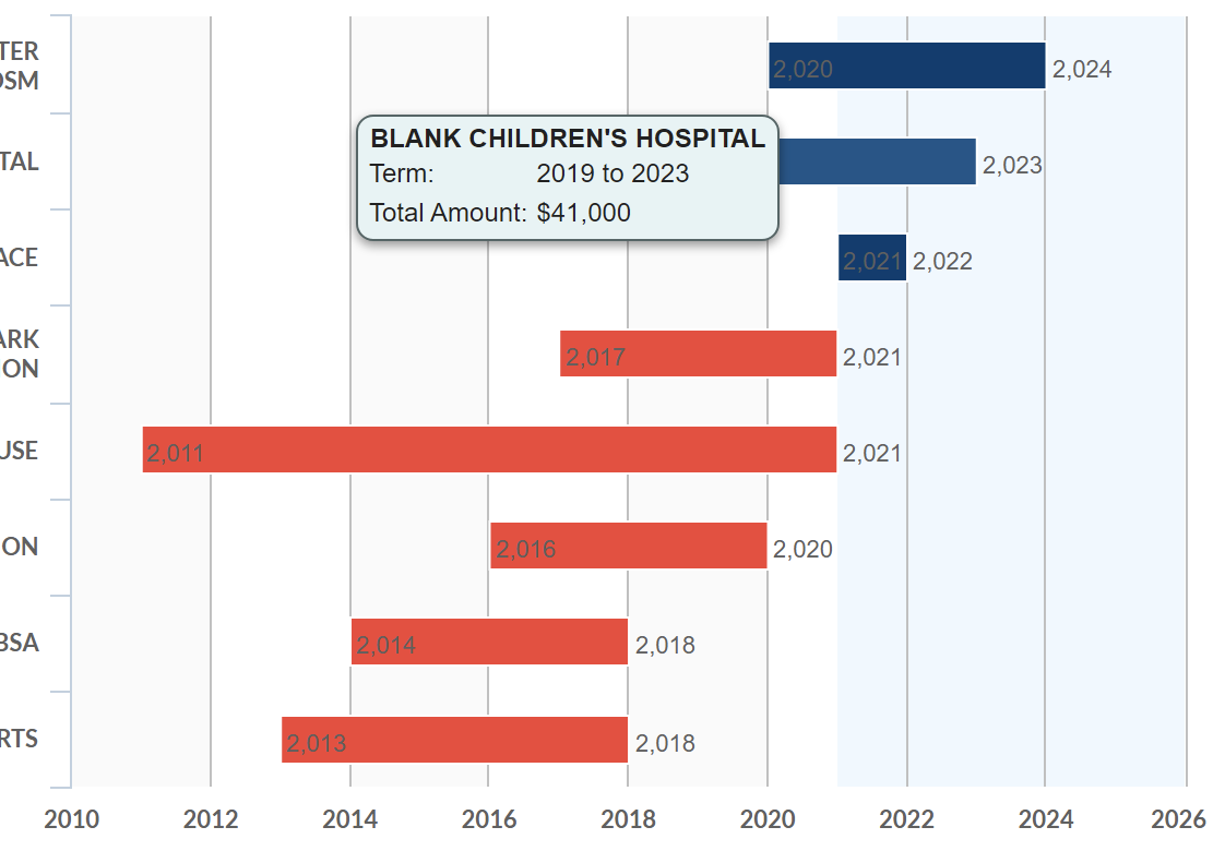
I turned on data labels and have a screenshot with the quick tip. Where the screenshot shows the end year I'd like it to have the cumulative amount attributed to the bar ($41,000 in this example).
 0
0 -
Hi Blake,
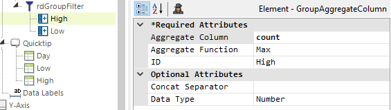
Have you tried defining High/Low as GroupAggregateColumns? I believe this is what is used to populate the Data Labels.
This is what I added to my report, for both High and Low, to get them to display their values in the Data Label.
Cheers,
Steve
0
Please sign in to leave a comment.
Comments
5 comments