Legend Color in CrossTab chart

I have a CrossTab chart and am applying colours based on the CrossTab label column. But then the Legend is based on the Crosstab column. How can I neutralise the colour of the legend? Previous versions of LOGI they were just "greyed" out.
-

To make it easier on the Forum, please post simple sample code that duplicates your issues.
I posted a solution, but it is pending approval. Last time this happened it sat unapproved for days. I may try to submit it again.1 -
Looks like Insight / Logi has flagged Forum responses with code and links for Approval. Hopefully this wasn't urgent.
0 -
<ChartCanvas
Animation="True"
AutoQuicktip="True"
BackgroundColor="Gainsboro"
BackgroundColorTransparency="7"
BorderColor="LightGray"
ChartCanvasTitle="Bar"
ChartCaption="Teams"
ChartHeight="450"
ChartOrientation="Vertical"
ChartTitle="Bar chart"
ID="cc-Teams"
PlotBackgroundColor="WhiteSmoke"
Stacking="normal"
>
<DataLayer
Type="Static"
>
<StaticDataRow
Month="Jan"
Percentage="75"
SeriesColor="Red"
Team="Liverpool"
/>
<StaticDataRow
Month="Jan"
Percentage="75"
SeriesColor="Blue"
Team="Man City"
/>
<StaticDataRow
Month="Jan"
Percentage="75"
SeriesColor="Black"
Team="Swansea City"
/>
<StaticDataRow
Month="Feb"
Percentage="80"
SeriesColor="Red"
Team="Liverpool"
/>
<StaticDataRow
Month="Feb"
Percentage="80"
SeriesColor="Blue"
Team="Man City"
/>
<StaticDataRow
Month="Feb"
Percentage="80"
SeriesColor="Black"
Team="Swansea City"
/>
<StaticDataRow
Month="March"
Percentage="65"
SeriesColor="Red"
Team="Liverpool"
/>
<StaticDataRow
Month="March"
Percentage="65"
SeriesColor="Blue"
Team="Man City"
/>
<StaticDataRow
Month="March"
Percentage="65"
SeriesColor="Black"
Team="Swansea City"
/>
<CrosstabFilter
CrosstabColumn="Month"
CrosstabLabelColumn="Team"
CrosstabValueColumn="Percentage"
CrosstabValueFunction="Sum"
ID="cfMonth"
>
<ExtraCrosstabLabelColumn
CrosstabLabelColumn="SeriesColor"
ID="SeriesColor"
/>
</CrosstabFilter>
</DataLayer>
<Series
ChartXDataColumn="Team"
ChartXDataColumnType="Text"
ChartYDataColumn="Percentage"
Color="@Chart.SeriesColor~"
DisableMouseTracking="False"
ID="sbPercentage"
LegendLabel="@Data.rdCrosstabColumn~"
Type="Bar"
/>
<ChartXAxis
AxisLineColor="Black"
AxisLineColorTransparency="0"
AxisLineThickness="1"
>
<AxisLabelStyle
FontAngle="0"
/>
</ChartXAxis>
<ChartYAxis
AxisCaption="Percentage"
AxisLineColor="Black"
>
<AxisCaptionStyle
CaptionSpacing="50"
FontSize="9pt"
/>
<AxisLabelStyle
FontFamily="Tahoma"
FontSize="8pt"
/>
<ChartTicksAndGrid
GridLineThickness="1"
TickLineColor="Black"
/>
</ChartYAxis>
<ChartCanvasLegend
BorderColor="LightGray"
BorderRadius="0"
LegendBorderThickness="1"
LegendOrientation="Horizontal"
LegendSpacing="15"
ShowAllThreshold="9999"
>
<LegendLabelStyle
FontFamily="Arial"
FontSize="8pt"
/>
</ChartCanvasLegend>
</ChartCanvas>0 -
Please see example above. Many Thanks
0 -
Your colors in your data layer are based on Team (your Chart X-Axis Label) but your crosstab (and legend ) are based on Month. So when the crosstab filter runs, it picks the first color for each date and uses that as the legend color. If you refresh, sometimes Logi changes the sort of the data and you get a different color.
You will either need to change your crosstab column to be based on Team and your label column to be Month so that your legend colors will align with the team showing for each month. You would use an Extra Value Column so that the colors align with the legend.
OR
Change your colors so that each month has a unique color so that when the crosstab runs it displays a different bar color for each month grouped by team using an extra value column.
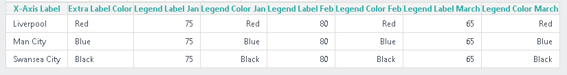
Team Crosstab Column with Unique Color per Team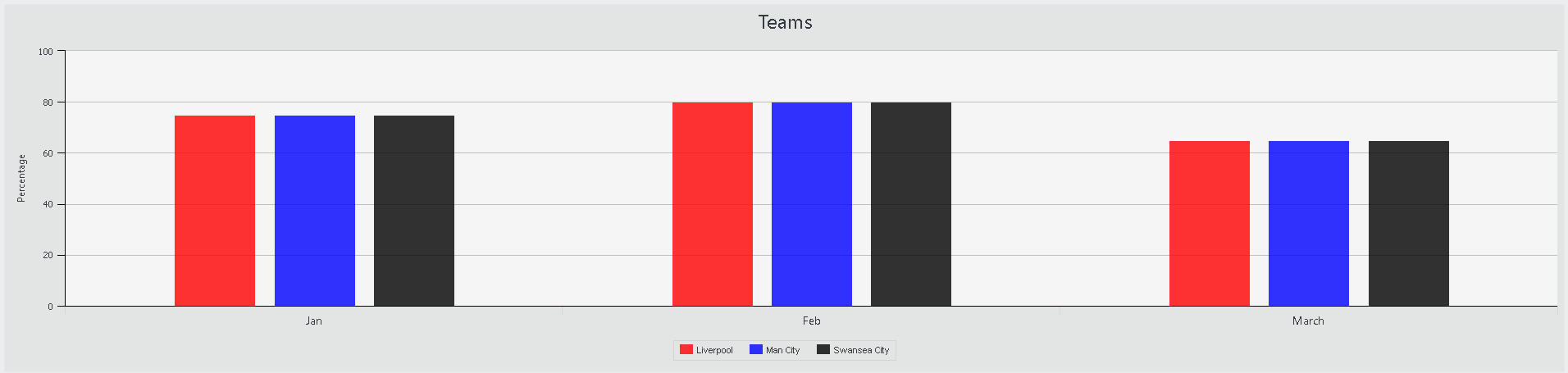
<ChartCanvas Animation="True" AutoQuicktip="True" BackgroundColor="Gainsboro" BackgroundColorTransparency="7" BorderColor="LightGray" ChartCanvasTitle="Bar" ChartCaption="Teams" ChartHeight="450" ChartOrientation="Vertical" ChartTitle="Bar chart" ID="cc-Teams" PlotBackgroundColor="WhiteSmoke" Stacking="normal">
  <Series ChartXDataColumn="Team" ChartXDataColumnType="Text" ChartYDataColumn="Percentage" Color="@Chart.evclSeriesColor~" DisableMouseTracking="False" ID="sbPercentage" LegendLabel="@Data.rdCrosstabColumn~" Type="Bar" />
  <DataLayer Type="Static">
    <StaticDataRow Month="Jan" Percentage="75" SeriesColor="Red" Team="Liverpool" />
    <StaticDataRow Month="Jan" Percentage="75" SeriesColor="Blue" Team="Man City" />
    <StaticDataRow Month="Jan" Percentage="75" SeriesColor="Black" Team="Swansea City" />
    <StaticDataRow Month="Feb" Percentage="80" SeriesColor="Red" Team="Liverpool" />
    <StaticDataRow Month="Feb" Percentage="80" SeriesColor="Blue" Team="Man City" />
    <StaticDataRow Month="Feb" Percentage="80" SeriesColor="Black" Team="Swansea City" />
    <StaticDataRow Month="March" Percentage="65" SeriesColor="Red" Team="Liverpool" />
    <StaticDataRow Month="March" Percentage="65" SeriesColor="Blue" Team="Man City" />
    <StaticDataRow Month="March" Percentage="65" SeriesColor="Black" Team="Swansea City" />
    <CrosstabFilter CrosstabColumn="Team" CrosstabLabelColumn="Month" CrosstabValueColumn="Percentage" CrosstabValueFunction="Sum" ID="cfMonth">
      <ExtraCrosstabLabelColumn CrosstabLabelColumn="SeriesColor" ID="eclcSeriesColor" />
      <ExtraCrosstabValueColumn ID="evclSeriesColor" CrosstabValueColumn="SeriesColor" CrosstabValueFunction="Any" />
    </CrosstabFilter>
  </DataLayer>
  <ChartXAxis AxisLineColor="Black" AxisLineColorTransparency="0" AxisLineThickness="1">
    <AxisLabelStyle FontAngle="0" />
  </ChartXAxis>
  <ChartYAxis AxisCaption="Percentage" AxisLineColor="Black">
    <AxisCaptionStyle CaptionSpacing="50" FontSize="9pt" />
    <AxisLabelStyle FontFamily="Tahoma" FontSize="8pt" />
    <ChartTicksAndGrid GridLineThickness="1" TickLineColor="Black" />
  </ChartYAxis>
  <ChartCanvasLegend BorderColor="LightGray" BorderRadius="0" LegendBorderThickness="1" LegendOrientation="Horizontal" LegendSpacing="15" ShowAllThreshold="9999">
    <LegendLabelStyle FontFamily="Arial" FontSize="8pt" />
  </ChartCanvasLegend>
</ChartCanvas>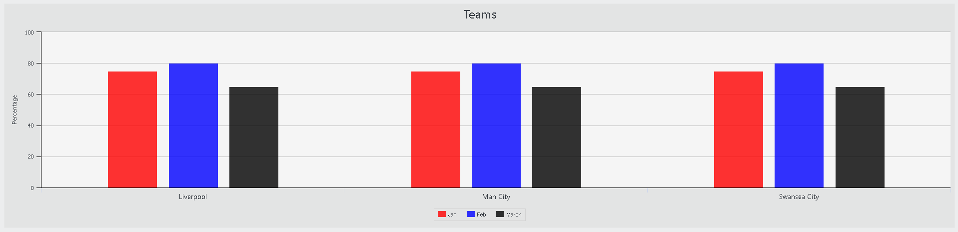
Month Crosstab Column with Unique color per Month
<ChartCanvas Animation="True" AutoQuicktip="True" BackgroundColor="Gainsboro" BackgroundColorTransparency="7" BorderColor="LightGray" ChartCanvasTitle="Bar" ChartCaption="Teams" ChartHeight="450" ChartOrientation="Vertical" ChartTitle="Bar chart" ID="cc-Teams" PlotBackgroundColor="WhiteSmoke" Stacking="normal">
  <Series ChartXDataColumn="Team" ChartXDataColumnType="Text" ChartYDataColumn="Percentage" Color="@Chart.evclSeriesColor~" DisableMouseTracking="False" ID="sbPercentage" LegendLabel="@Data.rdCrosstabColumn~" Type="Bar" />
  <DataLayer Type="Static">
    <StaticDataRow Month="Jan" Percentage="75" SeriesColor="Red" Team="Liverpool" />
    <StaticDataRow Month="Jan" Percentage="75" SeriesColor="Red" Team="Man City" />
    <StaticDataRow Month="Jan" Percentage="75" SeriesColor="Red" Team="Swansea City" />
    <StaticDataRow Month="Feb" Percentage="80" SeriesColor="Blue" Team="Liverpool" />
    <StaticDataRow Month="Feb" Percentage="80" SeriesColor="Blue" Team="Man City" />
    <StaticDataRow Month="Feb" Percentage="80" SeriesColor="Blue" Team="Swansea City" />
    <StaticDataRow Month="March" Percentage="65" SeriesColor="Black" Team="Liverpool" />
    <StaticDataRow Month="March" Percentage="65" SeriesColor="Black" Team="Man City" />
    <StaticDataRow Month="March" Percentage="65" SeriesColor="Black" Team="Swansea City" />
    <CrosstabFilter CrosstabColumn="Month" CrosstabLabelColumn="Team" CrosstabValueColumn="Percentage" CrosstabValueFunction="Sum" ID="cfMonth">
      <ExtraCrosstabLabelColumn CrosstabLabelColumn="SeriesColor" ID="eclcSeriesColor" />
      <ExtraCrosstabValueColumn ID="evclSeriesColor" CrosstabValueColumn="SeriesColor" CrosstabValueFunction="Any" />
    </CrosstabFilter>
  </DataLayer>
  <ChartXAxis AxisLineColor="Black" AxisLineColorTransparency="0" AxisLineThickness="1">
    <AxisLabelStyle FontAngle="0" />
  </ChartXAxis>
  <ChartYAxis AxisCaption="Percentage" AxisLineColor="Black">
    <AxisCaptionStyle CaptionSpacing="50" FontSize="9pt" />
    <AxisLabelStyle FontFamily="Tahoma" FontSize="8pt" />
    <ChartTicksAndGrid GridLineThickness="1" TickLineColor="Black" />
  </ChartYAxis>
  <ChartCanvasLegend BorderColor="LightGray" BorderRadius="0" LegendBorderThickness="1" LegendOrientation="Horizontal" LegendSpacing="15" ShowAllThreshold="9999">
    <LegendLabelStyle FontFamily="Arial" FontSize="8pt" />
  </ChartCanvasLegend>
</ChartCanvas>
0 -
Many Thanks for your suggestions but I will need the Crosstab Label to be Team. I have tried to change the color of the legend items using JavaScript but not quite there.
I have now tried to hide the legend by not having a Legend Label and remarking out the Legend element but legend still appearing :(
0 -
The crosstab element legend is automatically generated due to the Theme Modifier code on line 660-ish
 <UpdateOrAppendChildElement XPath=".//ChartCanvas[DataLayer/CrosstabFilter] | .//ChartCanvas[DataLayer/SqlCrosstab] | .//ChartCanvas[Series/DataLayer/CrosstabFilter] | .//ChartCanvas[Series/DataLayer/SqlCrosstab] | .//ChartCanvas[Series[@LegendLabel]]">
    <NewElement>
      <ChartCanvasLegend />
    </NewElement>
  </UpdateOrAppendChildElement>
Otherwise you should be able to hide the legend completely using css
    #idofchartcanvas .highcharts-legend {
        display: none !important;
    }
You may also want to look into the Highcharts Grouped Categories module
https://blacklabel.github.io/grouped_categories/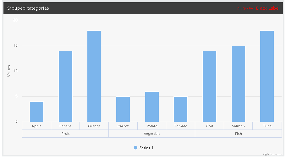 0
0 -
I have hidden the legend now using CSS but thought it would be easier with an attribute.
0
Please sign in to leave a comment.
Comments
8 comments