Input Select List
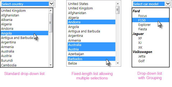
The purpose of the Input Select List element is to provide a drop-down list or fixed-length list of options, one or more of which can be selected. Here are three possible configurations:

This user Input element operates using collections of data and requires a datalayer to provide that data.
Using It
The default configuration is for a drop-down list, but a static list can be created by entering a value in the element's Rows attribute.
This element requires a datalayer to provide the items that will appear in the list. If the list of items is short and unchanging, the DataLayer.Static element can be used to "hard code" the items. If the list is longer, the DataLayer.XML element can be used to read the data from an XML file. If the list is dynamic, elements such as DataLayer.SQL can be used to retrieve the items from a datasource, possibly with grouping to provide unique values.
If the datasource provides one, the value passed to the next Report or Process task can be different from the displayed text. The control automatically sizes itself to accommodate the widest display text.
The element has many of the attributes common to all Input elements and includes these additional attributes:
| Attribute | Description |
|---|---|
Caption Column | (Required) Specifies the name of the datalayer column that contains the text to be displayed in the selection list. |
Value Column | (Required) Specifies the name of the datalayer column that contains the value to be passed to the next report or process task. For example, if "United Kingdom - Pound" is selected in the list, the value "GBP" might be passed to the next report. This allows the flexibility to display and pass different values and even different types of values, such as numbers. |
Default Value | Specifies a default value (not the displayed caption text). If it matches the value of an item in the list, then that item will be pre-selected in the control. Can be used with @Request tokens passed from another report or a process task, and other tokens. To specify multiple default selected values in an Input Select List configured for multiple selections, enter a comma-separated list of values. Do not include any spaces in the list. To use a data-driven set of default selected values, see the Default Values section below. |
Group Caption Column | Specifies the datalayer column that provides the text for group headings in the option list. The is the same column used by the datalayer's Group Filter to group the options. |
Group Class Column | Specifies the datalayer column that provides style sheet class names for the list's group captions. This allows each group caption to have its own styling, based on the data. |
Include Blank | These three attributes allow you to display and use a default item that is not based on data from the datalayer, for example, an instruction such as "Make a selection". See the notes below regarding use of these attributes under "Getting Its Data". |
List Captions Element ID | Specifies the element ID of an Input Hidden element, which will contain the Caption Column values for the items selected when the definition is submitted. The values will be available in a @Request token using the same ID. |
Multiple Selections | Specifies if multiple list items can be selected simultaneously, using the Ctrl or Shift keys. Default: False. |
Rows | Specifies the number of items to display in a static list, determining the height of the control on the page. If the number of items in the list exceeds this value, vertical scroll bars are enabled and the control will scroll. The default blank setting for this attribute causes a drop-down list to be displayed instead. |
Tooltip | Specifies text to be displayed as a tooltip when the mouse is hovered over the control and, if no Tooltip Column is specified, over the list of options. |
Tooltip Column | Specifies the datalayer column that contains text to be shown as a tooltip when the mouse is hovered over each item in the list of options. Can be used with or without the Tooltip attribute. |
This element can be used by itself or within an Input Grid element to make alignment with other Input elements easier.
 New for 14.1 Adding HTML Attribute Params to your User Input elements enables you to apply your application to work with other frameworks or libraries easier. Depending on the type of HTML Attribute Params you add, there will be different parameters available to use, or you can define your own parameters. If an attribute was set in both Element and HTML Attribute Params, the one set in the HTML Attribute Params will be ignored.
![]() If the Input Select List is placed under a Data Table that produces multiple rows, the Input Select List's datalayer only runs once and thus all select lists will have the same rows. In such an arrangement, you cannot reference @Data tokens from the parent Data Table in the Input Select List's datalayer.
If the Input Select List is placed under a Data Table that produces multiple rows, the Input Select List's datalayer only runs once and thus all select lists will have the same rows. In such an arrangement, you cannot reference @Data tokens from the parent Data Table in the Input Select List's datalayer.
Hierarchical Grouping
Input Select List elements can be configured to list their options in groups, with a group caption, as shown earlier.

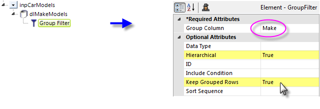
To use this, a Group Filter must be applied to the data, and its attributes set as shown above. Its Group Column value is the datalayer column that will supply the group captions.

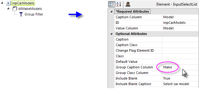
The Input Select List element's Group Caption Column attribute is configured with the same column name used in the Group Filter, as shown above. The Group Class Column attribute gives you the option of setting a different style for each group caption, in the data.
Adding Default Values
A list of default values for the Input Select List can also retrieved from a datalayer. The Input Select List element's Default Value attribute must be left blank in order to use this technique.

As shown above, a Default Valueselement, with its own datalayer, is added as a child of the Input element. Its Data Column attribute is set to the name of the datalayer column containing the default values. This has be effect of turning all of the values in all datalayer rows in this column into a comma-separated list which is then fed into the Input element as its default value.
Getting Its Data
The value (from the "Value Column") associated with the selected item (from the "Caption Column") is available in the next Report or Process task with a @Request token. For example, if the element's ID is set to lbxCurrency then the token @Request.lbxCurrency~will equal the selected item's value.
If you want to access the caption(s) of the item(s) selected, instead of or in addition to their values, set the List Captions Element ID attribute to the ID of an Input Hidden element. The caption(s) will be placed in this element when the report is submitted and will be available using a @Request token with the same ID. For earlier Info versions, see Passing Input Select List Captions.
![]() The availability of default data when using the Blank attributes varies based on the list type:
The availability of default data when using the Blank attributes varies based on the list type:
If you've specified a Blank Value and nothing is deliberately selected in a drop-down list (no Rows value) and the page is submitted, then the item visible in the control is considered selected and its value will be available using the @Request token.
However, if you've specified a Blank Value and nothing is selected in a static list(Rows > 0) and the page is submitted, then nothing is considered selected and this @Request token will not exist. This is an important distinction to note when creating conditional processing that evaluates this token.
If the Multiple Selections attribute is set to True, the @Request token will contain a comma-separated listof selected values. For use with SQL statements, it may be desirable to surround each individual value in the list with single quotes. This can be done using the SingleQuote token prefix. For example, consider the token:
@Request.MySelections~
which contains the string 1,2,3. When we apply the SingleQuote token prefix, like this:
@SingleQuote.Request.MySelections~
the token is modified so it now contains '1','2','3'which is acceptable in a SQL query.
More Information
For additional information, see the Element Reference entry for Input Select List.