Analysis Chart - Adding Additional Series
It's frequently useful to add additional series to the chart, allowing easier visual comparisons. Controls are available for this:

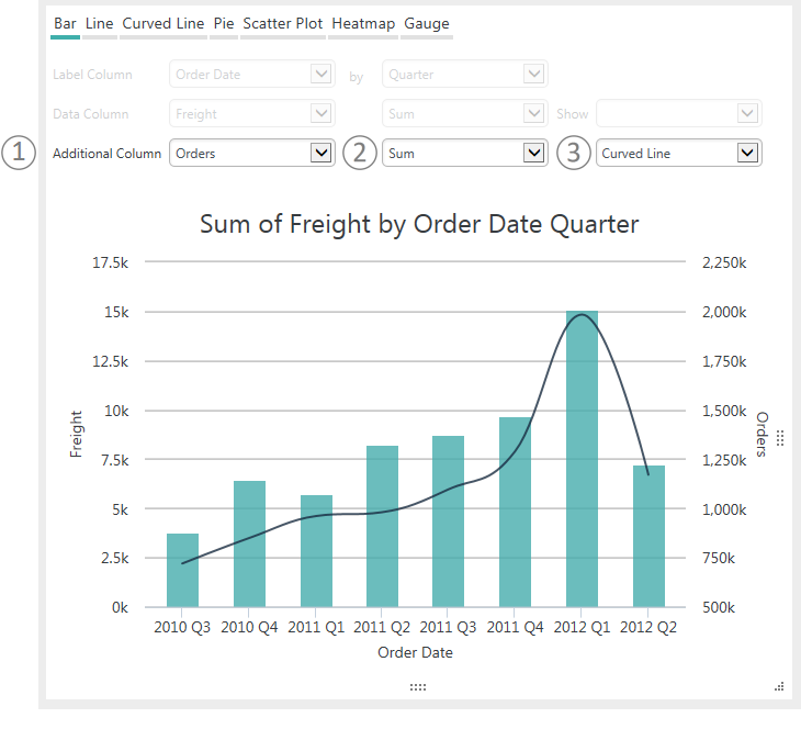
When the chart type (Bar, Line, Curved Line, Scatter Plot) supports it, the (1) Additional Column control will be available for you to use in selecting the Data Column for a second series. The second series (2) Aggregation and (3) Chart Type can be selected to suit your needs. A second axis and label will appear automatically along the side of the chart opposite the original Y-axis, as shown above.
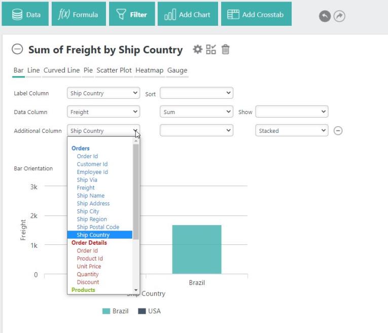
To add an additional column to your chart, select the Additional Column drop-down menu:

Then, select the column you want to add. Repeat these steps to add multiple additional columns.
Depending on the chart type, other controls will appear for use configuring additional series, including aggregation options and charting types. These controls allow you to choose between Stacked, Stacked Percentage, and Side By Side:

Aggregation options include Count, Sum, or Distinct Count:

Additional options for charts include Bar, Line, Curved Line, and Scatter Plot with Dual or Single Axis graphs:

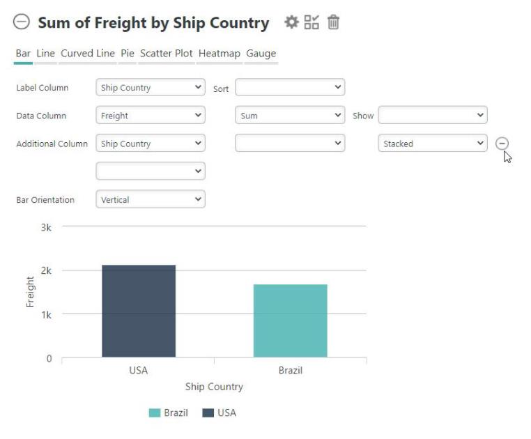
Remove the additional column(s) by selecting the - icon:

![]() If you only have one additional column, selecting the blank option at the top of the Additional Column drop-down menu will also remove the additional column.
If you only have one additional column, selecting the blank option at the top of the Additional Column drop-down menu will also remove the additional column.