Logi Studio Geography
Logi Studio has a simple layout that makes it easy to develop applications and provides an array of features and tools. Learning "what's where" is the first thing you should do when beginning to work with Studio.
The Getting Started Dialog Box
The first time you launch Studio, you'll see the Getting Started dialog box:
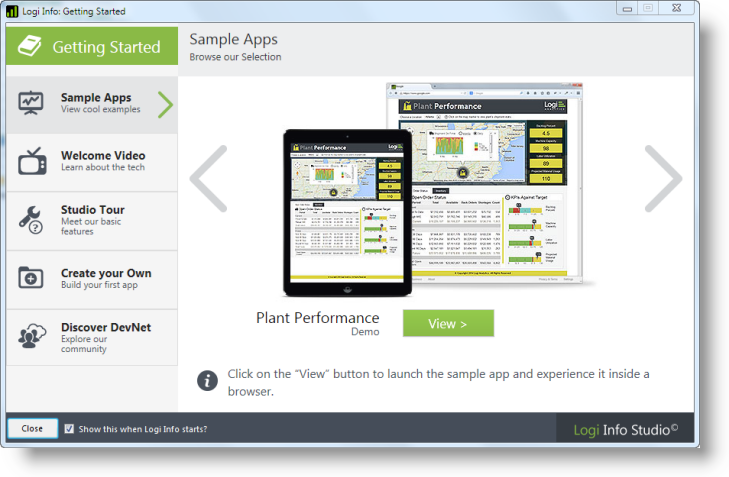
The dialog box, shown above, contains everything you need to quickly become familiar and productive with Studio. You should definitely explore all of its contents if you're a Logi Info newbie. You can hide it when you no longer need it.
The Welcome Panel
With the Getting Started dialog box hidden, you'll see the Welcome panel when you start Studio and whenever there's no application open.
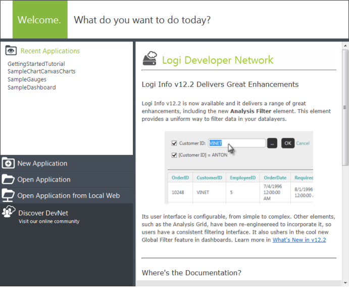
The Welcome panel provides quick links to recently-opened applications, links that open applications using a variety of methods, and a link to DevNet, our online community. In addition, you'll see some useful content, from DevNet, displayed in a scrolling area.
Working on an Application
When you open an application in Studio and begin editing a report definition, it looks like this:
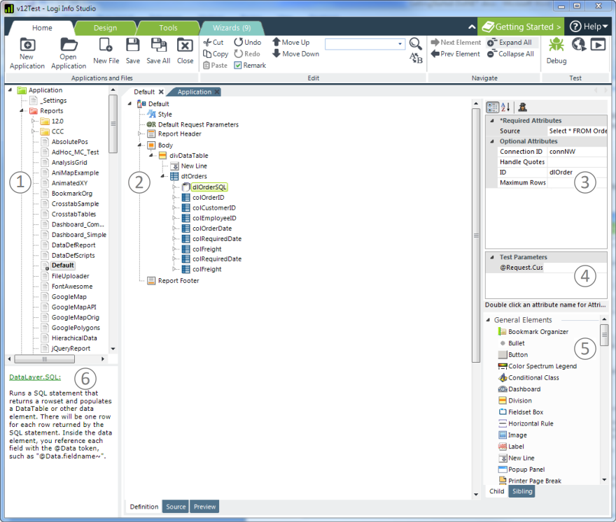
Logi Studio uses six standard panels, which can be resized to suit your needs:
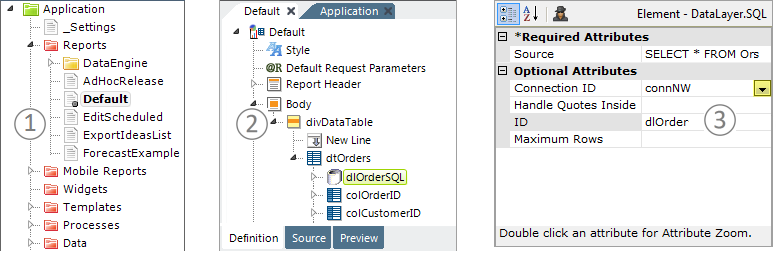
- The Application panel groups all of the files that make up a Logi application together into one file management tree.
 A Filter Definitions control is available at the top of the Application panel for filtering definitions in all categories at once. Clear the control to remove all filters.
- The Workspace panel is where files are edited. Tabs at the top are displayed for each file that's opened, as well as the Welcome and Application pages. Different editors are displayed within the tab pages depending on the file type being edited (report definition, style sheet, XML data, etc.). Report definitions (shown) display the elements that make up a report, in a hierarchical Element Tree.
When editing report definitions, tabs at the bottom are displayed for switching between views of the Element Tree (the Definition), the underlying XML source code (Source), and a mini-browser preview of your work (Preview). When the Preview or Source tab is selected, the Element Toolbox, Attributes, and Test Parameters panels are automatically hidden, allowing the full width of the Workspace panel to be used.
- The Attributes panel is where developers enter element attribute values. Attributes can be sorted Alphabetically or by Category and the Attribute Spy feature can be invoked. Attribute names can be double-clicked to open a "zoom" window for easier data entry. For some attributes, valid choices, in a selection list, can be summoned by clicking a down-arrow or mini-browse button in their value field.
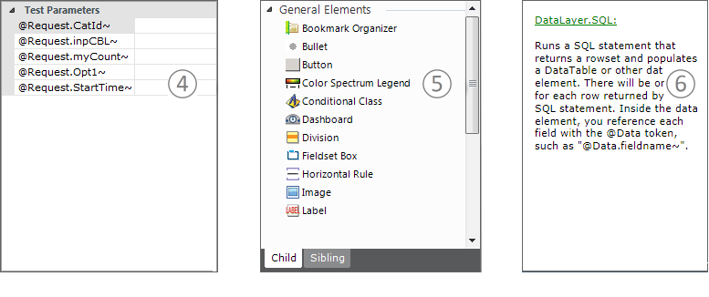
- The Test Parameters panel allows you to insert values as for parameters that are normally passed to the page. This panel is only visible if the report expects parameters and is not displayed until a report has been run or previewed once. Test values entered here are applied to a definition viewed inside Studio using Preview, but are not applied if the definition is viewed in a browser.
- When an element is selected in the Element Tree in the Workspace panel, the Element Toolbox panel provides a list of context-appropriate wizards and child elements that can be added to the Element Tree. Tabs at the bottom filter the element selection between child and sibling elements.
A Filter Elements control is available at the top of the Element Toolbox panel for filtering elements in all categories at once. Clear the control to remove all filters.
- The Information panel includes quick help text; the element or topic name is a link to more information on DevNet.
Panel Arrangement
The Attribute and Element Toolbox panels can be re-arranged to suit your preference, using the Tools![]() View menu options:
View menu options:
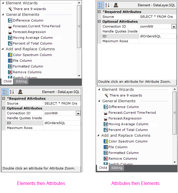
In a vertical layout, the order of the Element Toolbox and Attributes/Test Parameters panels can be specified, as shown above.
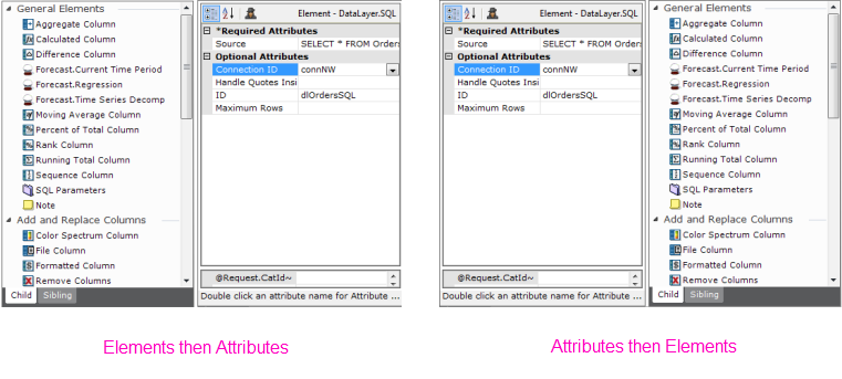
Or, in the optional horizontal layout, the panels can be arranged in the order you desire, as shown above.