Using Icons in Tabbed Panels
Finally, let's see how we can use multiple icons in tabbed panels.
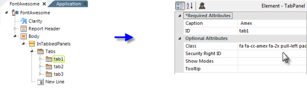
In the example above, a Tab element and several Tab Panel elements have been added. Each panel is supposed to contain information about different credit cards, so let's place their names and an icon for each card in their respective tabs. We can do this with a Class attribute value of:
fa fa-cc-amex fa-2x pull-left padTB10
The fa-cc-xxxx class will be different for each type of credit card. The only class you won't recognize is padTB10, which is in a separate style sheet added for this example app and provides some top and bottom padding inside the tabs.
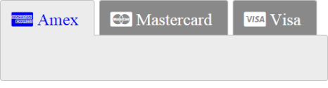
And the results are shown above.
 The height of the tabs and the size of the text is being controlled by the height of the icon + the padding.