What are Responsive Rows?
Responsive rows (and similarly Bootstrap's Grid system) provide a container that is divided into a twelve column grid. The benefit of this approach is that it allows the designer to assign how many of the 12 grid columns a container (Responsive Column) will take up at various Break Points (viewport pixel resolution where the grid behaves differently).
Responsive Rows provides the following Break Points:
| Device | Width | Attribute Name |
|---|---|---|
| Extra small devices: phones | < 768 pixels | Extra Small Screen |
| Small devices: tablets | ≥ 768 pixels | Small Screen |
| Medium devices: desktops | ≥ 992 pixels | Medium Screen |
| Large devices: desktops | ≥ 1200 pixels | Large Screen |
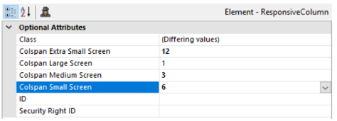
For example, the following configuration provides a design where a single column takes up all 12 of the grid columns on Extra Small devices, but only 1 of the 12 grid columns on Large devices.
Large Screen
![]()
Medium Screen
Small Screen

Extra Small Screen

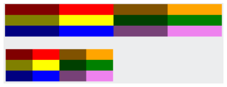
If we place the above Responsive Rows element within a container that only takes up 50% of the Viewport, the result is similar, only now the grid takes up half of the Viewport. The responsive behavior of the columns, however, is still based on the overall Viewport size (not the size of the container). At Medium Screen size, each Responsive Column will take up 3 of the 12 grid columns.
When to use Responsive Rows?
Responsive Rows are perfect for when the content they contain is variable in size. Text blocks, images, and even visualizations work great together.
It is even possible to use nested Responsive Rows elements to achieve a dynamic layout within other elements such as this example on http://eod.logianalytics.com/Logi2019
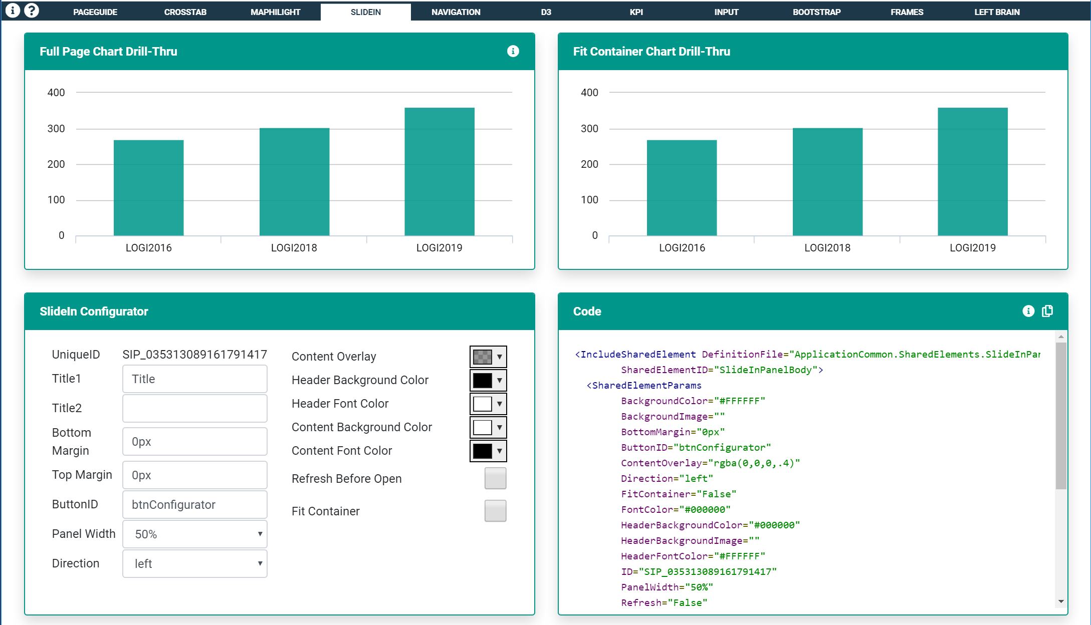
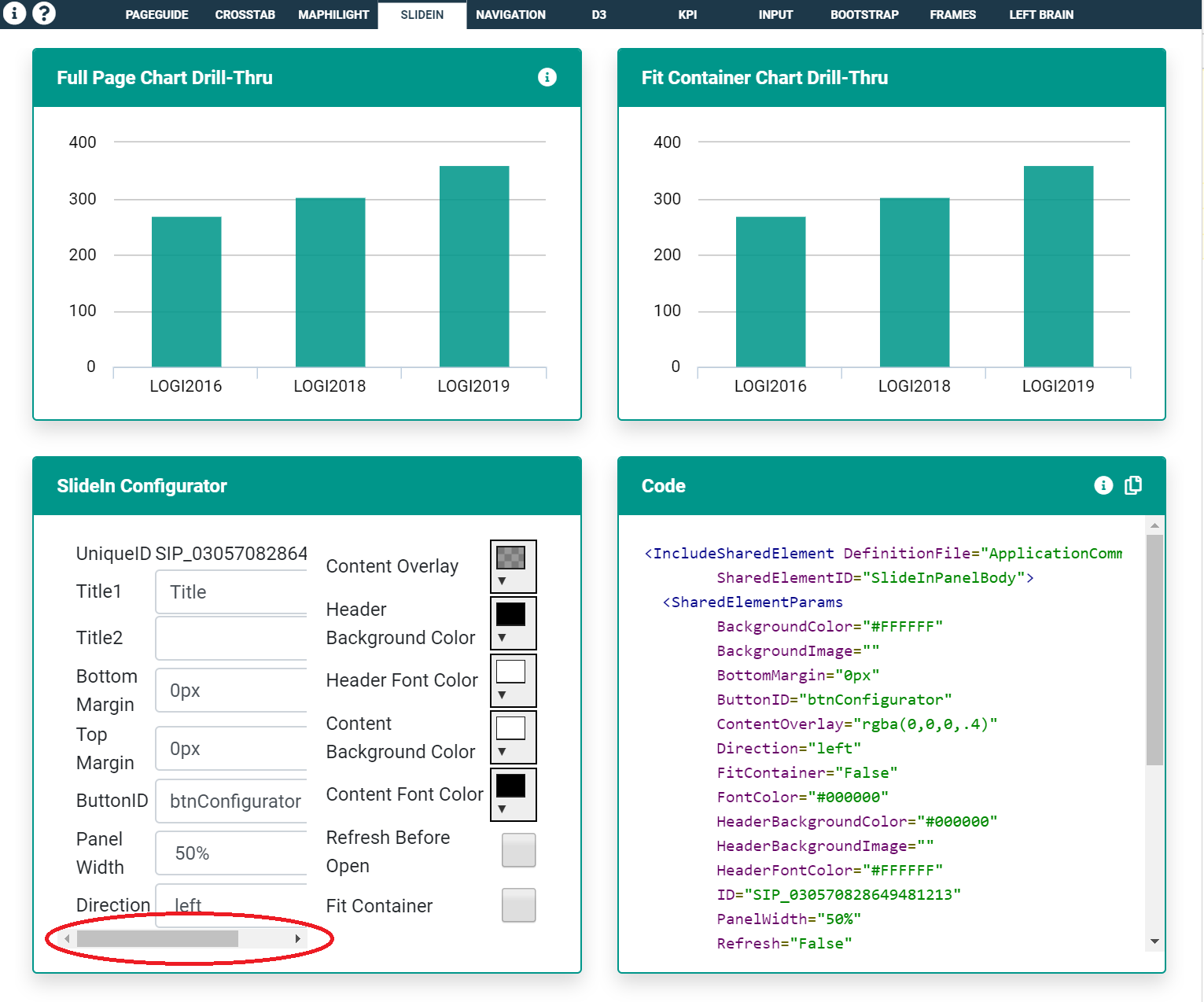
On smaller screen sizes the two-column form displays as a single column while the basic layout of the page doesn't change.
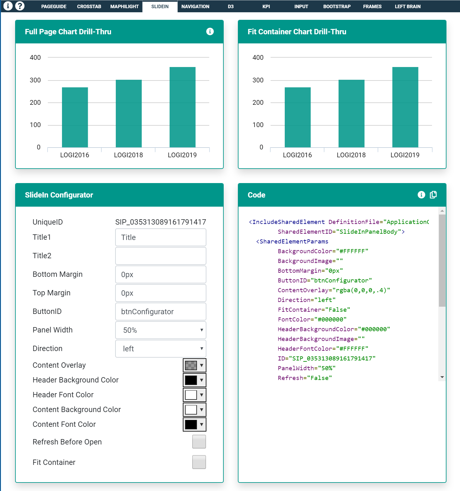
This configuration is not perfect as there are some issues with the layout between breakpoints. Notice the scrollbar in the left-hand column of the form. In this example, the issue is caused by the long UniqueID string of text and could easily be resolved with some additional CSS.
When NOT to use Responsive Rows?
Responsive Rows do not work well when content is set to a specific width. This is because the width of a Responsive Column changes based upon the viewport size. If the contents contained within are set to a specific width, there will be situations where there will be too much white-space between content on larger screens, and other situations where it will most certainly cause a scrollbar similar to the form situation above.
![]()
The above screenshot is an example of too much white-space between elements. Sure these form inputs will look decent on a small screen, but there are better ways for content like this to behave responsively (see Flex Box).
Responsive Rows and Columns will not always work well within Dashboard Panels. Logi Dashboards can be displayed in a multitude of layouts (Freeform, 2-column, 3-column, etc). While there shouldn't be too much concern about using Responsive Rows elements within a Freeform Dashboard (the dashboard layout is typically the full width of the viewport and thus Responsive Rows work as expected), in columnar dashboard layouts, the width of dashboard panels can vary based on the number of columns available, however, the responsive behavior of the Responsive Rows will still be based upon the overall viewport size. In the following example, the same layout is seen within each panel even though each panel is sized differently. This is because Responsive Columns are based on the viewport size, not the container size.

It may also be tempting to use Responsive Rows and Columns to build the overall layout of your application (for example a navigational header, side filter panel, content section, and footer section). These sections of your application should actually be well defined with Containers (Divisions, Rows/Row/Column, etc). CSS and more specifically @Media queries will provide precise control of the application layout and allow adjustment at any viewport size your require.