Basic Tab Elements
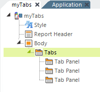
Two elements, Tabs and Tab Panel, are used to implement tabbed panels in Logi reports:

As shown above, the Tabs element is the parent of one or more Tab Panel child elements.

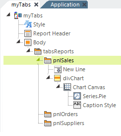
As mentioned earlier, Tab Panel elements can contain a wide variety of other elements, including those for tables, charts, user input, images, labels, and more. In the example above, a Chart Canvas pie chart has been placed in the first tab panel.
Notice that the example shown above uses a Division element ("divChart") in the Tab Panel, and it contains the pie chart. This is the proper way to align content in the panel. The division's Class attribute can be set to a style class that will, for example, center its contents, and you must also set its Output HTML Div Tag attribute to True to make it work.
![]() Division elements also include "HTML Attribute Params", enabling you to apply your application to work with other frameworks or libraries easier. With the HTML Attribute Params, you have the option to include "style" parameters. If an attribute was set in both Element and HTML attribute params, the one set in the HTML attribute params will be ignored.
Division elements also include "HTML Attribute Params", enabling you to apply your application to work with other frameworks or libraries easier. With the HTML Attribute Params, you have the option to include "style" parameters. If an attribute was set in both Element and HTML attribute params, the one set in the HTML attribute params will be ignored.
You can specify an exact size for Tab Panels but, if you do not, they will automatically size themselves to their contents.