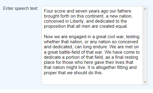
Input Text Area
The purpose of this element is to allow multi-line entry of text. It's very similar to the Input Text element but allows paragraph-style text entry.

Using It
This element has most of the attributes of the Input Text element and includes these two additional attributes:
| Attribute | Description |
|---|---|
Input Columns | Specifies the width of the input box, in characters. |
Rows | Specifies the number of lines of text that will be visible in the input box, affecting its height on the page. Text entered will automatically wrap to the next line if it exceeds the width of the text box. If the number of lines of text entered exceeds this attribute's value, vertical scroll bars are displayed and the text scrolls. |
This element can be used by itself or within an Input Grid element to make alignment with other Input elements easier.
 New for 14.1 Adding HTML Attribute Params to your User Input elements enables you to apply your application to work with other frameworks or libraries easier. Depending on the type of HTML Attribute Params you add, there will be different parameters available to use, or you can define your own parameters. If an attribute was set in both Element and HTML Attribute Params, the one set in the HTML Attribute Params will be ignored.
Getting Its Data
The data placed into this element will be available in the next report or process by using an @Request token. For example, if the element's ID is set to txtSpeech, then its data will be available as the token @Request.txtSpeech~.
More Information
For additional information, see the Element Reference entry for Input Text Area.