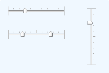
Input Slider
The purpose of this element is to provide one, or a pair of, sliding "thumbs" that can be used to adjust numeric value inputs. The thumbs are clicked and dragged to change the input value and the thumb scale orientation can be horizontal or vertical.

Using It
The slider can be oriented horizontally or vertically. It does not have a Caption attribute, so a caption for this element must be provided separately. It features several standard attributes; other attributes of interest include:
| Attribute | Description |
|---|---|
ID | (Required) Specifies the unique element ID associated with this control. This ID is used with an @Request token after the page is submitted to identify the data value for the first sliding thumb. |
Background Image | Specifies the filename of an image for the background of the slider; if left blank, a default image is supplied. An image provided here is not stretched to fit; it must exactly fit the size of the slider; tick marks are automatically generated. |
Decimal Points | Specifies the number of decimal places in the data values. The default is 0, which causes the slider to return only integer values. |
Default Value | Specifies the default value associated with the first sliding thumb, shown when the report page is first displayed. |
Minimum Value | Specifies the range of numeric values represented by the slider scale. The default values are 0 and 100, respectively. |
Second Default Value | Specifies the default value associated with the second sliding thumb, if used, when the report page is first displayed. |
Second Slider ID | Specifying a value here causes a second sliding thumb to be displayed; leave this blank to display just one sliding thumb. This ID is used with an @Request token after the page is submitted to identify the data value for the second thumb. |
Slider Length | Specifies the width or height of the slider, in pixels, depending on the Slider Orientation attribute. The value represents the distance that the thumbs can move. Default: 200 pixels. |
Slider Orientation | Specifies the orientation of the slider: horizontal or vertical. Default: Horizontal. |
Slider Thumb Offset Left | Allows fine adjustment, in pixels, of the thumb image positioning, so that it aligns well with the slider. |
Thumb Image | Specifies the filename of an image for the thumbs; if left blank, a default (shown above) is used. |
Thumb Separation Value | When there are two sliding thumbs, specifies the minimum separation allowed between them. The value is based on the values of the Min Value and Max Value attributes, not in pixels. |
Tick Count | Specifies the number of "detents", or stopping points, at which the thumbs will stop when dragged. Using this value, the detents are evenly distributed across the length of the slider; tick marks are automatically created. |
This element cannot be used within an Input Grid element. If multiple Input Slider elements are used on a page, ensure that each thumb has a unique ID.
This element causes two DHTML events to occur. These can be used with Event Handler elements to provide user feedback, to refresh the current page, or to launch another report. The onDrag event is fired as a thumb is dragged, and the onChange event is fired when the dragging operation finishes.
This element incorporates a JavaScript function that can be called from script to set the slider value. The function syntax is:
rdInputSliderSet('sliderID', value)
This element will not appear in exported reports.
 New for 14.1 Adding HTML Attribute Params to your User Input elements enables you to apply your application to work with other frameworks or libraries easier. Depending on the type of HTML Attribute Params you add, there will be different parameters available to use, or you can define your own parameters. If an attribute was set in both Element and HTML Attribute Params, the one set in the HTML Attribute Params will be ignored.
Getting Its Data
The numeric value selected using this element will be available in the next Report or Process task by using an @Request token. For example, if the element's ID attribute is set to "Thumb1" and its Second Slider ID attribute is set to "Thumb2", then the selected values will be available in the next page or process task as the tokens @Request.Thumb1~ and @Request.Thumb2~.
More Information
For additional information, see the Element Reference entry for Input Slider.