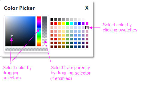
Input Color Picker
The Input Color Picker was significantly improved in this release. Users of earlier Info v12 releases will see a subset of the features described here.
This element provides a visual interface for color selection. The current
color selection appears as an icon next to a palette icon.

Clicking either icon displays the Color Picker pop-up panel, as shown
above, from which new selections can be made.
Using It
This element shares many of the standard Input element attributes and
includes these special attributes:
| Attribute | Description |
|---|---|
Allow Transparency | Specifies whether the Color Picker pop-up panel will include a slider for selecting the transparency of the selected color. The default value is False. |
Color Picker Caption | Specifies a custom caption for the Color Picker pop-up panel. The default value is Color Picker. |
Default Value | Specifies the selected default color, by name, decimal RGB or RGBA value, or hex RGB value. Prefix hex values with the pound sign, like #112233. |
Popup Modal | Specifies whether or not the Color Picker pop-up panel will be "system modal". Modal pop-ups disable the rest of the page until the panel is closed and the disabled area behind the panel get shaded in transparent gray. |
 New for 14.1 Adding HTML Attribute Params to your User Input elements enables you to apply your application to work with other frameworks or libraries easier. Depending on the type of HTML Attribute Params you add, there will be different parameters available to use, or you can define your own parameters. If an attribute was set in both Element and HTML Attribute Params, the one set in the HTML Attribute Params will be ignored.
Getting Its Data
The value associated with the color selected from the palette is available in the next Report or Process task with an @Request token. For example, if the element's ID is set to inpColors then the token @Request.inpColors~will equal that value. This value will always be in hex RGB format: #112233.
More Information
For additional information, see the Element Reference entry for
Input Color Picker.