Input Date
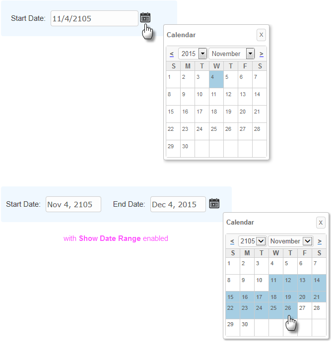
The purpose of this element is to allow the entry of a date or date range. It's similar to the Input Text element and a date can be typed right into it. It can also include an icon or link beside it which allows a date to be selected from a small pop-up calendar.

In the pop-up calendar, the current date is highlighted with one color and the selected date (or range of dates) is highlighted with another. Colors can be configured with CSS by overriding style classes found in <yourApp>\rdTemplate\rdCalendar\rdDataCalendarStyle.css.
Using It
The Input Date element shares many of the attributes of the Input Text element and also has these additional attributes:
| Attribute | Description |
|---|---|
Calendar Caption Format | Specifies the format of the text above the popup calendar. Set to None to prevent display of the caption row entirely. |
Calendar Link | These three attributes specify the type of popup calendar link, if any, that appears beside the text box. A small calendar image is provided or a custom image or text can be used. |
Default Value | Specifies the default date that will appear in the text box. Can be used with @Function.Date~ token to display the current date in Short Date format. |
End Date Default Value | Specifies the default value for the "end" date in a date range, if used. |
End Date Range Caption | Specifies the caption for the "end" date text box, if used. |
End Date Range ID | Specifies the ID to be associated with the "end" date text box, if used. This is the ID that will be used with a @Request token when the page is submitted. |
Input Date Reformat | Causes the date entered to be reformatted into one of several formats before being made available as a request variable. More information can be found Format Data. |
Number of Dropdown Years | Specifies the number of years that will appear in the Year drop-down list in the pop-up calendar associated with the input element. This value creates a range of years with the current year in the middle of the list. |
Show Date Range | This attribute causes two text input boxes for dates to be displayed. If the popup calendar feature is used (Calendar Link Type = Image or Text), the first date selected becomes the value for the starting date; the second date selected sets the value for the ending date. Additional attributes are available that allow you to specify a Caption, Default Value, and ID for the second text input box. Dates can range over 1, 2, or 3 months. |
The Input Date Calendar element can be added as a child of Input Date and used to configure the pop-up calendar. Input Date Calendar has the same attributes and behavior as the Date Picker element, which is described in Date Picker.
The control does not provide an "input mask" to control the format of what can be typed into it. Instead, developers must validate the date entered when the page is submitted, using Validation elements, or when various DHTML events occur, using Event Handler elements. For more information about validation and events, see Working with User Input Elements.
This element can be used by itself or within an Input Grid element to make alignment with other Input elements easier, and a special element, Validation.Date, is available as a child of Input Date, to ensure that a valid value is entered by the user.
 New for 14.1 Adding HTML Attribute Params to your User Input elements enables you to apply your application to work with other frameworks or libraries easier. Depending on the type of HTML Attribute Params you add, there will be different parameters available to use, or you can define your own parameters. If an attribute was set in both Element and HTML Attribute Params, the one set in the HTML Attribute Params will be ignored.
Getting Its Data
The data placed into this element will be available in the next report or process by using an @Request token. For example, if the element's ID is set to txtHireDate, then its data will be available as the token @Request.txtHireDate~.
If Show Date Range is being used to allow entry of a date range, then the starting date is available using an @Request token that includes the Input Date element's ID, and the ending date is available using an @Request token that includes the ID specified in the End Date Range ID attribute.
Globalization and Localization
The format and presentation of calendars and dates varies widely depending on country and/or language. Some aspects of the date-related input elements are controlled by the "preferred language" settings of the browser being used and others may be affected by the default date and time format settings of the client operating system.
At the application level, date-related aspects of your Logi application can also be changed by adding and configuring a Globalization element in the application's _Settings definition. For example, it has two attributes, Default Input Date Format and Default Input Date Reformat, that can be used, if desired, to specify a format with global scope.
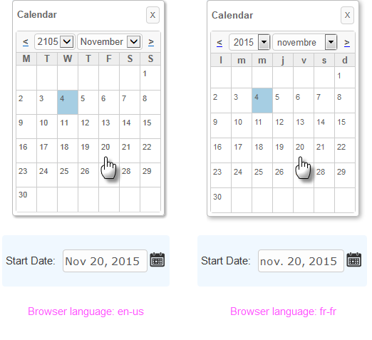
Setting the Globalization element's First Day of Week attribute will change the display of the calendars associated with Input elements. If the attribute value is set to 1, then Monday will be the first day in the calendar; the default is Sunday. More information about the Globalization element can be found in Internationalization and Localization .
In addition, the browser's preferred language setting will affect the pop-up calendar display and date value format:

In the examples shown above, a Globalization element has been used to change the first day of the week to Monday and the browser's preferred language has been set first to English and then to French. Notice that the month name and day-of-weekabbreviations in the calendar changed based on the browser's preferred language setting.
In addition, the actual value returned after the user clicks on a date, shown below the calendars, also reflects the language preference in any text it contains - "Nov" vs. "nov.". The element's Format attribute, of course, controls the format of the date value returned into
the element's input text box after the mouse click.
![]() In a "globalized date" scenario, when passing/submitting dates from your input controls to other definitions for use within tokens, as filters on queries, or within elements such as the Compare Filter, we highlyrecommend utilizing the ISO 8601 standard date format (yyyy-MM-dd) to avoid any locale/browser date conflicts that might arise. The input element's Input
Date Reformat attribute
can
be used for this purpose.
In a "globalized date" scenario, when passing/submitting dates from your input controls to other definitions for use within tokens, as filters on queries, or within elements such as the Compare Filter, we highlyrecommend utilizing the ISO 8601 standard date format (yyyy-MM-dd) to avoid any locale/browser date conflicts that might arise. The input element's Input
Date Reformat attribute
can
be used for this purpose.
More Information
For additional information, see the Element Reference entry for Input Date.