Dimension Grid Settings Panels
The Dimension Grid Panel elements determine what data and which options are available to the user at runtime. Let's examine the panels:
Panel | Description |
| Options in this panel allow the user to select the data that will populate each row in the Data Table. The options are the names of Dimensions in the cube, which represent specific columns in the datalayer. The data for the selected dimension will appear in the left-most column of the Data Table. They're added to the report definition using XOLAP Dimension elements. Option selection is mutually-exclusive: clicking one cancels a previously selected option. |
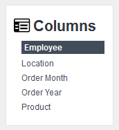 | Options in this panel allow the user to select the data that will populate each column in the Data Table. The options are the names of Dimensions in the cube, which represent specific columns in the datalayer. The data for the selected dimension will appear in the top-most row of the Data Table, as column headers. They're added to the report definition using XOLAP Dimension elements. Option selection is mutually-exclusive: clicking one cancels a previously selected option. |
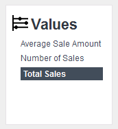 | Options in this panel allow the user to select the data values that will appear in the cells that are the intersections of rows and columns. The links are the names of Measures, which are aggregations, calculations, and summarizations of the data in the datalayer. They're added to the report definition using XOLAP Measure elements. Option selection is not mutually-exclusive: multiple options can be selected at once and clicking a selected option "unselects" it. |
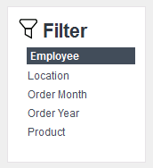 | Options in this panel allow the user to set one or more filters that exclude some or all of the data values for all dimensions. Filter options are automatically created for each dimension. When an option is selected, a popup panel displays the values and check boxes; un-checking a box removes that data from the grid. Option selection is not mutually-exclusive: multiple options can be used at once. When a filter has been imposed, the option is highlighted, as shown at left, as an indication that filtering is being used. |
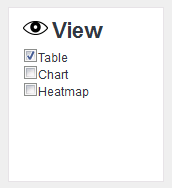 | check boxes in the panel determine which data visualizations (table, chart, and heatmap) will be displayed. |
Table, charts, and heatmaps are themselves also Dimension Grid Panel elements and, along with all the rest, can be selectively shown or hidden by the report developer.
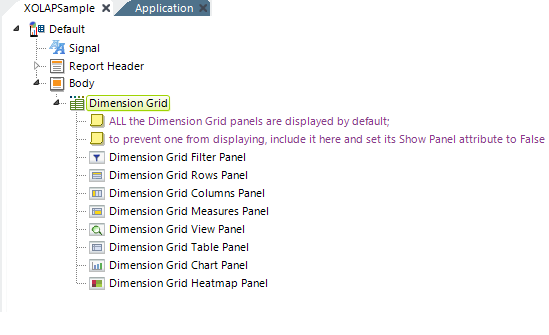
The report definition for the Dimension Grid shown earlier, with all its panel elements, looks like the example above. ![]() Regardless of the arrangement of the elements, the panels will always be displayed in the browser in the order shown in the first image in this topic. So, for example, you can't make the Rows and Columns panels appear below the Data Table.
Regardless of the arrangement of the elements, the panels will always be displayed in the browser in the order shown in the first image in this topic. So, for example, you can't make the Rows and Columns panels appear below the Data Table.
Dimension Grid Panel elements are not required. By default, if you leave them out, all panels will be displayed. To hide a panel, include its grid panel element and set its Show Panel attribute to False. This value can also be set using @Request and @Session tokens.
The table, chart, and heatmap panels include attribute values for initially setting them as visible or hidden, and the chart panel includes an additional Color attribute that lets you select a custom color set for the charts. To set custom colors, enter a color by name, decimal RGB value, or hex RGB value. Prefix hex values with the pound sign, e.g. #112233. Colors for charts with multiple series can be specified as a comma-separated list. The use of a built-in Theme will provide colors automatically.
One interesting possible use-case is to show only the chart and not the Data Table, heatmap, or any other panels. Drill-down into the data would still be available through the chart and this might be a useful configuration, for example, in a Dashboard.
