Edit Filter Control Dialog (for Library Component)
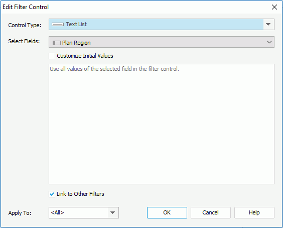
The Edit Filter Control dialog for library component appears when you right-click a filter control and select Edit Filter Control from the shortcut menu. It helps you to edit the filter control. See the dialog.
The following are details about options of the dialog:
Control Type
Select a type from the drop-down list.
Select Fields
Specifies the fields to bind to the filter control from the drop-down list. All the selected fields should be of the same data type. The uncomparable data type fields cannot be bound to a single filter control, such as Binary, Blob, Clob, Longvarchar, Longvarbinary, and Varbinary.
The common usage is to select one field, and then based on the field to filter the data of the components created on the same business view as the selected field.
To filter components using different business views, choose a common field all the business views contain and select the field in all the business views one by one.
Customize Initial Values
By default all values of the selected fields will be used in the filter control. You can check the option to customize the value list.
The customization UI is different according to control types:
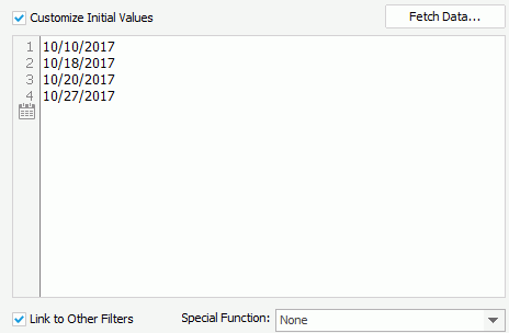
- For Text List and Single Value Slider

- Fetch Data
Opens the Fetch Data dialog to select values from the database and adds the selected values to the text box below. - Text box
You can type in values directly in the text box. Make sure the accuracy of their formats and values.The text box is an editable multi-row plain text box. It supports general text editing operations including copy, paste, cut, backspace, delete and etc. The Enter key on the keyboard is used to start a new row. Each row is a value of the user defined value list.
When Customize Initial Values is selected but the text box is empty, all values of the selected fields will be used in the filter control.

Specifies a Date/Time value in the text box.- Special Function
Specifies a special function for the selected fields. Available to Single Value Slider only when the selected fields are of Date/Time type.
- Fetch Data
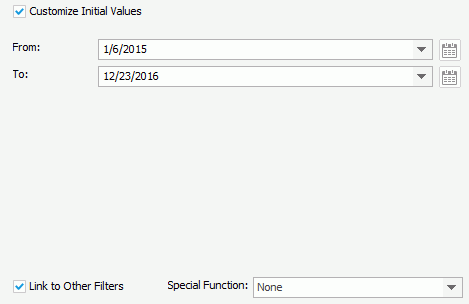
- For Range Slider

- From
Select the start value of the slider from the drop-down list or type the value in the text box. For the Date/Time type, you can also select the button to specify a value.
 - To
Select the end value of the slider from the drop-down list or type the value in the text box. For the Date/Time type, you can also select the button to specify a value.
 - Special Function
Specifies a special function for the selected fields. Available only when the selected fields are of Date/Time type.
- From
Link to Other Filters
Specifies whether the filter control can be affected by other on-screen filters that apply to the same data components and that contain the same data type of fields from the same business view as the filter control.
Here other filters include all the other on-screen filters that are applied to the data components which the filter control is applied to.
- Example of other filters
When
Filter1 is applied to DC1, DC2, and DC3.
Filter2 is applied to DC1.
Filter3 is applied To DC2.
Filter4 is applied to DC2 and DC3.
The result:
For Filter1, other filters are Filter2, Filter3, and Filter4.
For Filter2, other filter is Filter1.
For Filter3, other filters are Filter1 and Filter4.
For Filter4, other filters are Filter1 and Filter3.
- Example of different behaviors when Link to Other Filters is set to true and false
There are three filter controls and they all apply to a table:
FC_Country contains the Country field and Link to Other Filters is true.
FC_City contains the City field and Link to Other Filters is true.
FC_City1 contains the City field and Link to Other Filters is false.
When you select USA in FC_Country, the cities that do not belong to USA will be grayed in FC_City while FC_City1 is not affected.
Apply To
Specifies the target data components you want to apply the filter control to. The drop-down list includes all the data components in the current library component that are based on the same business views the selected fields are in.
OK
Inserts a filter control into the library component and closes the dialog.
Cancel
Cancels the operation and closes the dialog.
Help
Displays the help document about this feature.
 Previous Topic
